



We've collected the best 30 Angular components for web developers that will help you to build amazing applications faster and easier. See them in the article!
According to the 2025 Stack Overflow Developer Survey, Angular remains one of the most widely used web frameworks worldwide. It's favored for its robust architecture, scalability, and comprehensive ecosystem of libraries and components.
Whether you're building a simple web app or a complex enterprise solution, the right Angular components can dramatically accelerate your development process and improve the quality of your end product.
In this comprehensive guide, we've curated the 30 best Angular components that every developer should know about. These components have been selected based on their functionality, community support, maintenance status, and overall quality.
1. Angular Material

Angular Material is the official Material Design component library for Angular. Built and maintained by the Angular team at Google, it provides a complete suite of UI components that follow Material Design guidelines.
Components include buttons, cards, dialogs, form fields, navigation elements, data tables, and much more. Angular Material is accessible by default and supports theming through a powerful CSS variable system.
2. NGX-Bootstrap
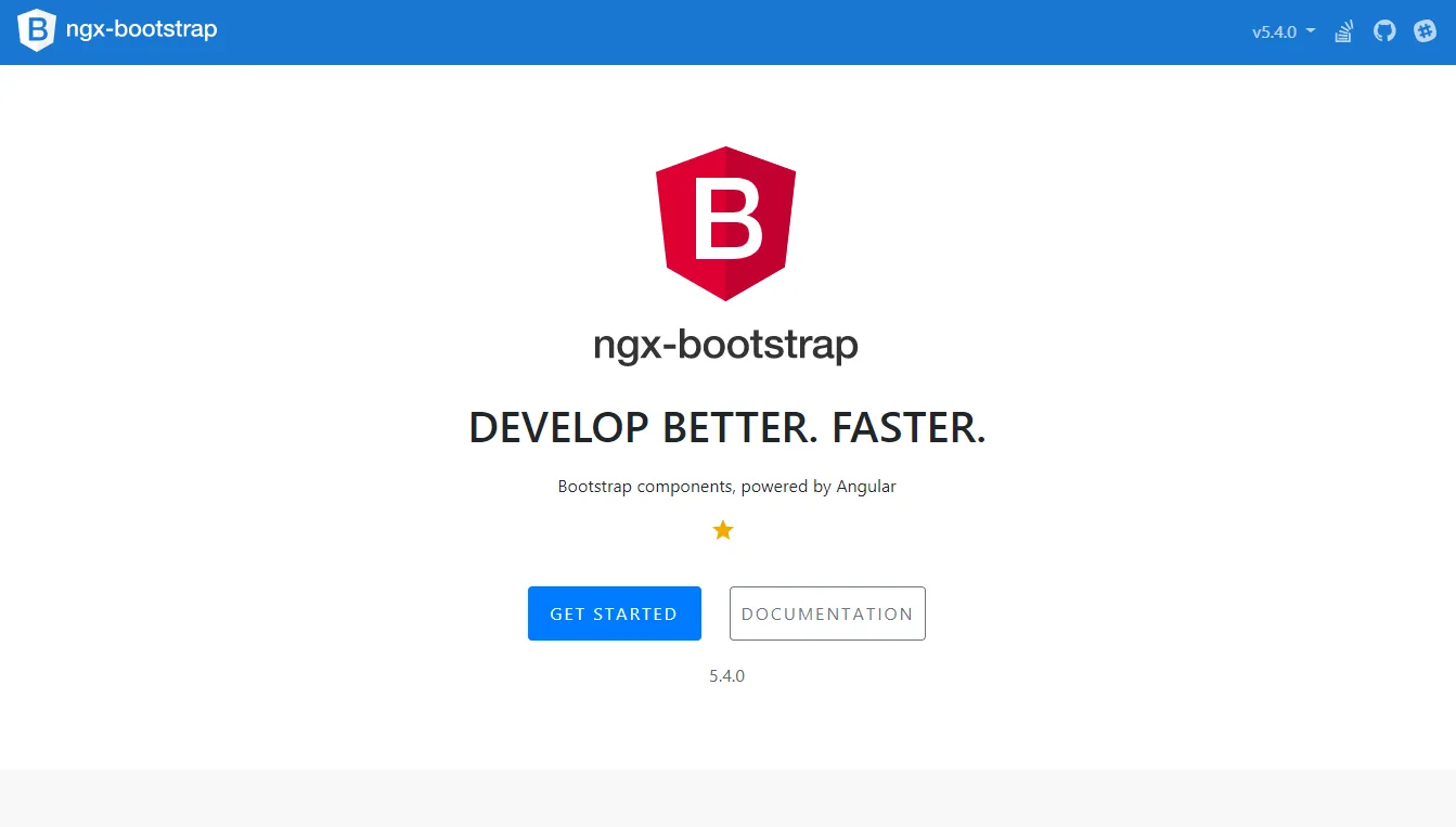
NGX-Bootstrap is a set of Bootstrap components rebuilt for Angular. It provides native Angular implementations of Bootstrap's UI components, eliminating the need for jQuery while preserving the familiar Bootstrap look and feel.
This library is a solid choice for teams already familiar with Bootstrap who want to bring those components into an Angular project without relying on the original JavaScript implementations.
3. Ng2-charts

Ng2-charts is an Angular wrapper for Chart.js, one of the most popular JavaScript charting libraries. It makes it easy to add beautiful, responsive charts to Angular applications using a declarative component API.
Supported chart types include bar, line, pie, doughnut, radar, polar area, and bubble charts. Each chart is highly customizable and responds to data changes in real time.
4. Dragula
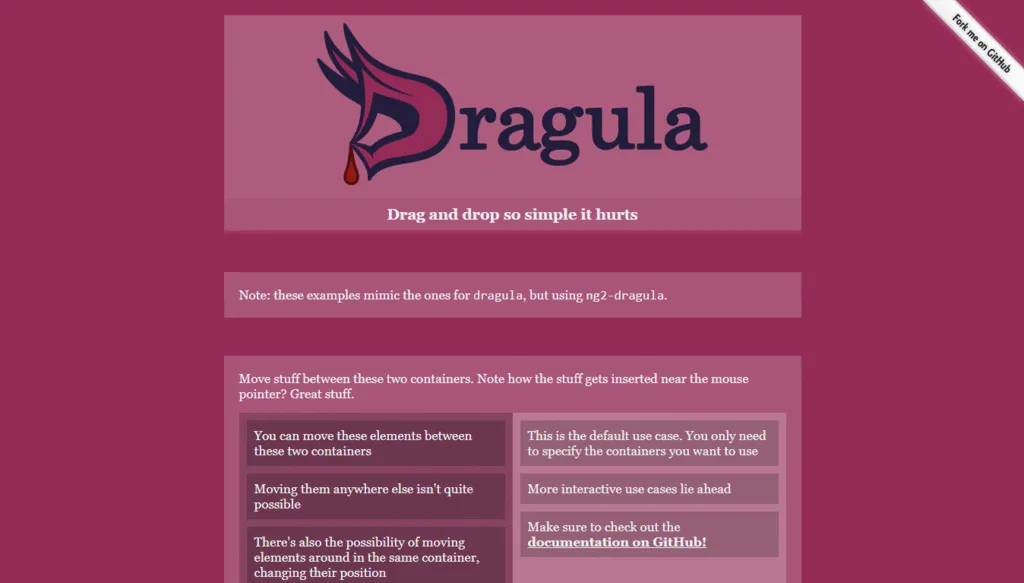
Dragula provides drag-and-drop functionality for Angular applications. The Angular wrapper for the popular Dragula library allows you to make any list or container support drag-and-drop reordering with minimal configuration.
It handles touch events, multiple containers, and copying between lists, making it a versatile choice for building Kanban boards, sortable lists, and other interactive layout elements.
5. Nebular

Nebular is a customizable Angular UI library built on top of Eva Design System. It provides a rich set of UI components, authentication modules, and security features tailored for enterprise-grade applications.
Nebular comes with multiple built-in themes and supports dark mode out of the box. Its authentication and role-based access control modules make it a strong choice for applications that require login flows and permission-based UI.
6. Ng2-file-upload
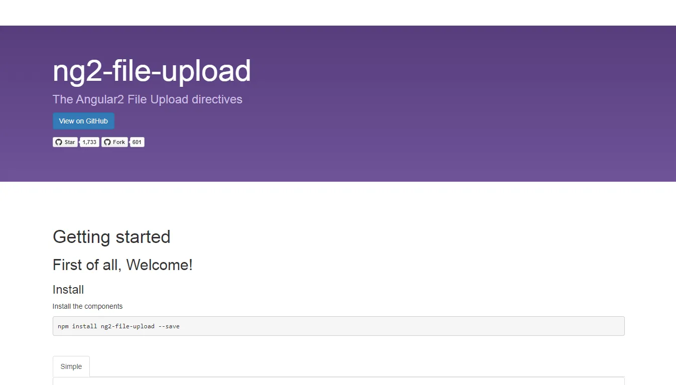
Ng2-file-upload is a lightweight Angular library for handling file uploads. It supports single and multiple file selection, drag-and-drop upload zones, upload progress tracking, and server-side integration.
It's simple to configure and works well with REST APIs, making it a go-to solution for applications that require users to upload documents, images, or other files.
7. Ng2-handsontable
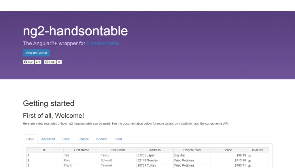
Ng2-handsontable is an Angular wrapper for Handsontable, a spreadsheet-like data grid component. It provides Excel-style editing capabilities for Angular applications, including cell editing, column sorting, row selection, and data validation.
This is a great component for applications that need to display and edit large datasets in a familiar tabular interface.
8. Ng2-select
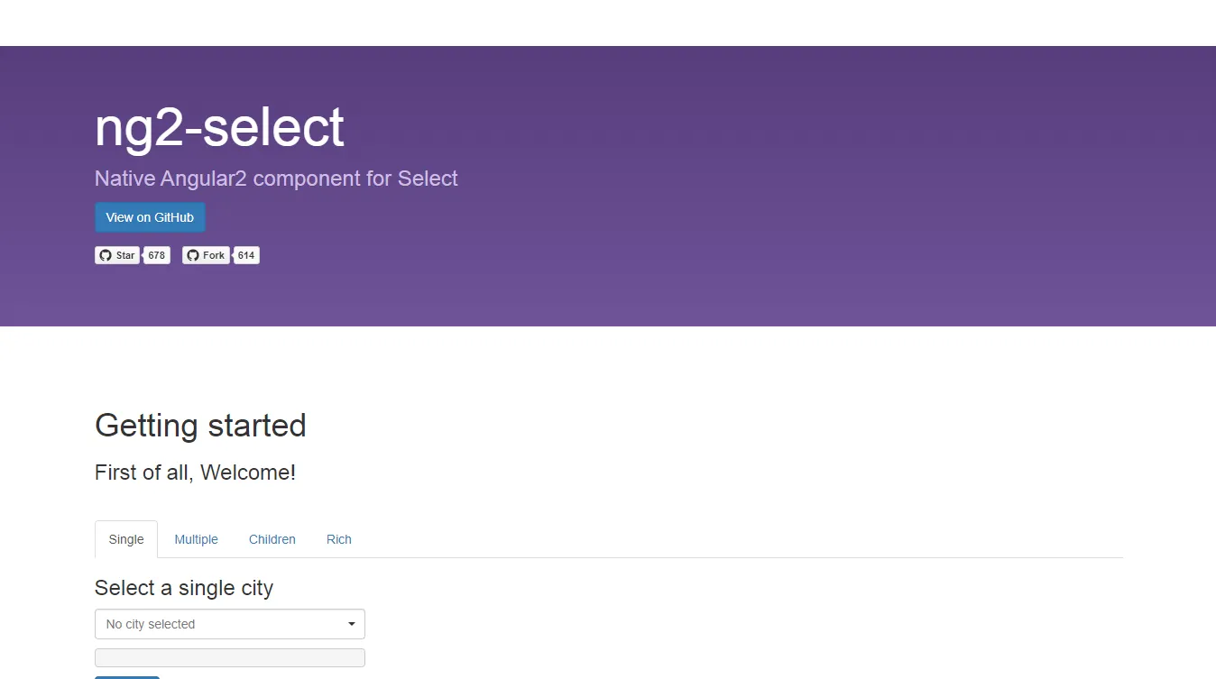
Ng2-select is a select component for Angular that supports single and multi-selection, search filtering, and custom templates. It's a more feature-rich alternative to the native HTML select element.
With support for async data loading and remote search, it's well-suited for dropdowns that need to query a backend API as the user types.
9. Angular Google Maps (AGM)
Angular Google Maps (AGM) provides Angular components for integrating Google Maps into your application. It exposes Google Maps functionality through a clean Angular API, including markers, info windows, polylines, polygons, and map event handling.
AGM is the standard choice for Angular projects that need map-based features such as location pickers, route visualization, or geospatial data display.
10. Ngx-dropdown

Ngx-dropdown is a lightweight Angular component for creating dropdown menus. It supports nested menus, keyboard navigation, and custom content inside the dropdown panel.
It's a straightforward solution for applications that need contextual menus, navigation dropdowns, or action menus without the overhead of a full UI component library.
11. Ngx-progress-bar

Ngx-progress-bar integrates a slim, YouTube-style progress bar into Angular applications. It's commonly used to indicate page load progress during navigation or data fetching, providing a subtle visual cue that something is happening in the background.
It integrates with Angular's router to automatically show and hide based on navigation events, making it nearly effortless to implement.
12. Fuel-UI

Fuel-UI is a collection of Angular components and directives styled with Bootstrap. It provides components like accordions, carousels, date pickers, tabs, and tooltips that complement the standard Bootstrap component set.
It's particularly useful for teams using Bootstrap as their base design system who need additional UI building blocks beyond what ngx-bootstrap provides.
13. PrimeNG

PrimeNG is one of the richest and most comprehensive Angular UI component libraries available. It includes over 90 components covering everything from basic inputs to complex data grids, charts, media players, and virtual scrollers.
PrimeNG ships with multiple free themes and premium theme packs, and it has excellent TypeScript support. It's widely used in enterprise Angular applications where a broad range of ready-to-use components is needed.
14. Ng-bootstrap
%202026-07-14%2012-56-53.webp)
Ng-bootstrap provides native Angular implementations of Bootstrap widgets. Unlike NGX-Bootstrap, which adapts the original Bootstrap JavaScript components, ng-bootstrap rewrites each widget from scratch in Angular without any dependency on jQuery or Bootstrap's JavaScript.
The result is a set of components that integrate more naturally with Angular's change detection and module system. Components include modals, popovers, tooltips, carousels, accordions, and date pickers.
15. Ng2-fontawesome

Ng2-fontawesome is an Angular component for using Font Awesome icons. It provides a declarative component API for rendering any Font Awesome icon by name, with support for sizing, rotation, animation, and stacking.
It simplifies icon integration into Angular templates, eliminating the need to manage raw CSS class strings and making it easy to control icon appearance through Angular bindings.
16. Font Awesome for Angular

The official Font Awesome Angular package provides the most up-to-date and maintained way to use Font Awesome icons in Angular. It uses a library approach where you import only the icons you need, keeping bundle sizes small.
It supports all Font Awesome icon styles and integrates with Angular's tree-shaking, so unused icons are automatically removed from production builds.
17. Angular X fullPage.js

Angular X fullPage.js is an Angular wrapper for the fullPage.js library, which creates full-screen scrolling websites and presentations. It enables section-based scrolling with smooth transitions, making it popular for landing pages and portfolio sites.
It supports horizontal slides within sections, lazy loading of content, and keyboard and touch navigation.
18. Ngx-easy-table

Ngx-easy-table is a lightweight, feature-rich data table component for Angular. It supports sorting, pagination, filtering, column resizing, and row selection, all with a simple configuration-based API.
Unlike heavier alternatives, it's designed to be small and fast while still covering the most common table use cases. It's a good option for applications that need a capable table component without pulling in a full UI framework.
19. Ngx-admin
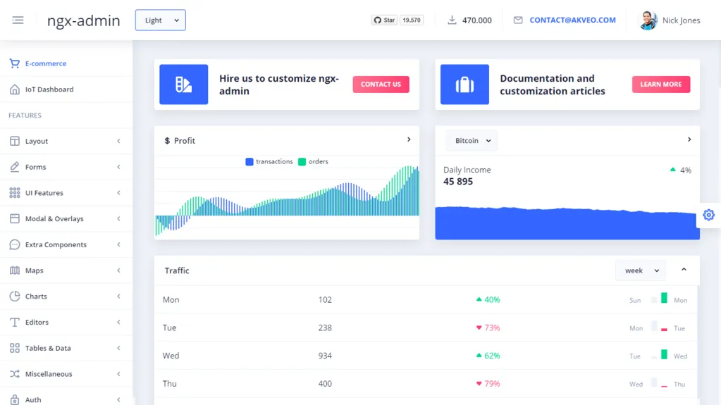
Ngx-admin is a popular open-source admin dashboard template built on Angular and Nebular. It provides a fully-featured admin panel with sidebar navigation, charts, forms, tables, authentication screens, and a dark theme, all ready to use out of the box.
It's one of the most starred Angular UI projects on GitHub and is widely used as a starting point for building internal dashboards and admin interfaces.
20. Ngx Admin Backend Bundles
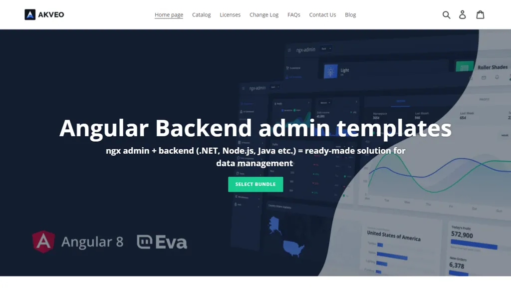
The Ngx-admin backend bundles extend the base ngx-admin template with pre-built integrations for common backend frameworks. These include server-side implementations for authentication, API endpoints, and data management that pair with the ngx-admin frontend.
They're useful for quickly spinning up a full-stack admin panel without having to build the backend from scratch.
21. Ng2-start

Ng2-start is a minimal Angular starter template with pre-configured tooling, including TypeScript, Webpack, and testing setup. It's aimed at developers who want a clean, minimal starting point for new Angular projects without the overhead of a full CLI-generated scaffold.
It provides a solid foundation for greenfield projects while giving full control over build configuration.
22. Ng2-notifications
Ng2-notifications wraps the browser's Web Notifications API for Angular, enabling applications to send native desktop push notifications. It's useful for applications that need to alert users about events even when the browser tab is not in focus.
Common use cases include messaging apps, task management tools, and dashboards that monitor real-time data.
23. Ngx-formly
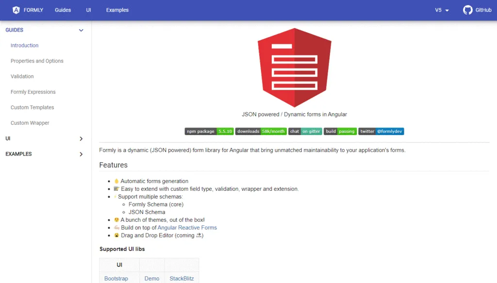
Ngx-formly is a dynamic form library for Angular that allows you to define forms through JSON configuration rather than template HTML. It supports reactive forms and integrates with all major Angular UI component libraries, including Angular Material, PrimeNG, and ngx-bootstrap.
It's particularly powerful for applications with complex, dynamic forms that change structure based on user input, API responses, or role-based permissions.
24. Ng-lazyload-image

Ng-lazyload-image is an Angular directive for lazy loading images. It defers image loading until the image is close to entering the viewport, reducing initial page load times and saving bandwidth for users who don't scroll through an entire page.
It supports placeholder images, blur-up transitions, and custom scroll container targets, making it flexible enough to handle a wide range of lazy loading scenarios.
25. Ng-lazyload-image (standalone directive)
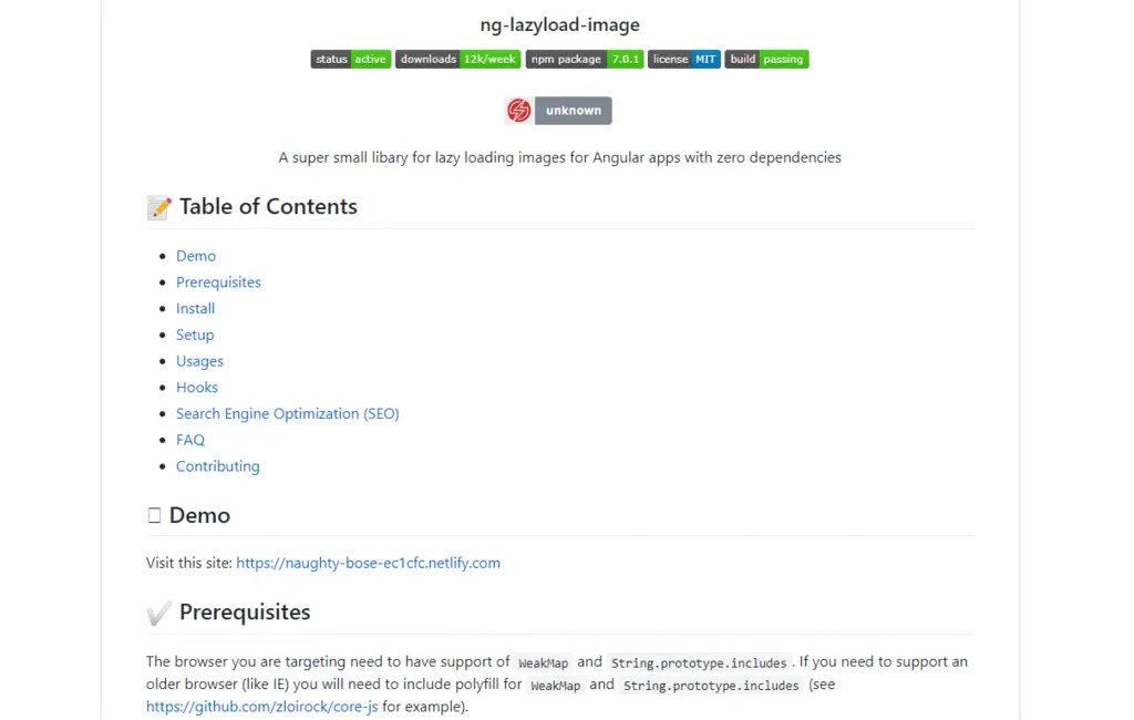
The standalone Ng-lazyload-image directive provides the same lazy loading functionality with a slightly different API, focused on flexibility for complex scroll containers and custom loading strategies. Both packages are commonly found in Angular projects depending on the version and configuration needs.
26. Ng2-minimal
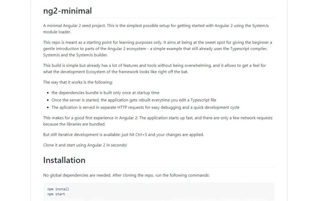
Ng2-minimal is a minimal Angular starter kit designed for teams that want fine-grained control over their project setup. It includes only the essential configuration for TypeScript, module loading, and testing, leaving everything else open for customization.
It's useful as a reference implementation for understanding Angular's build pipeline or as a foundation for projects with very specific toolchain requirements.
27. Ng2-table
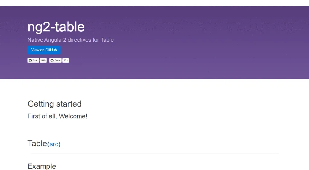
Ng2-table is a simple, configurable table component for Angular with built-in support for pagination, sorting, and filtering. It's a lightweight option for displaying tabular data without needing a heavyweight data grid library.
While less feature-rich than AG Grid or ngx-datatable, it covers the essentials and is easy to integrate into small to medium-sized applications.
28. Ngx-tabs
Ngx-tabs provides a tabbed navigation component for Angular. It supports dynamic tab creation, tab destruction, lazy content loading, and custom tab templates. Tabs can be linked to Angular routes for deep linking and browser history support.
It's a clean, dependency-light choice for applications that need tabbed layouts without importing a full component library.
29. Ngx-tabs (alternative implementation)

An alternative ngx-tabs implementation exists with a slightly different component API and styling approach. Both are commonly used depending on project requirements and the Angular version being targeted.
BLK DESIGN SYSTEM ANGULAR

BLK Design System for Angular is a free, dark-themed admin template built on Bootstrap and Angular. It provides a dark-mode-first UI with a modern aesthetic, pre-built pages, and a component library that includes cards, charts, forms, and navigation elements.
It's a good starting point for developers building dark-themed admin panels or dashboards who want a pre-designed system to work from.
ESSENTIAL JS 2 FOR ANGULAR
Essential JS 2 for Angular is a comprehensive set of Angular UI components from Syncfusion. It includes over 65 components covering grids, charts, diagrams, editors, calendars, and more. All components are built natively for Angular and designed for performance and accessibility.
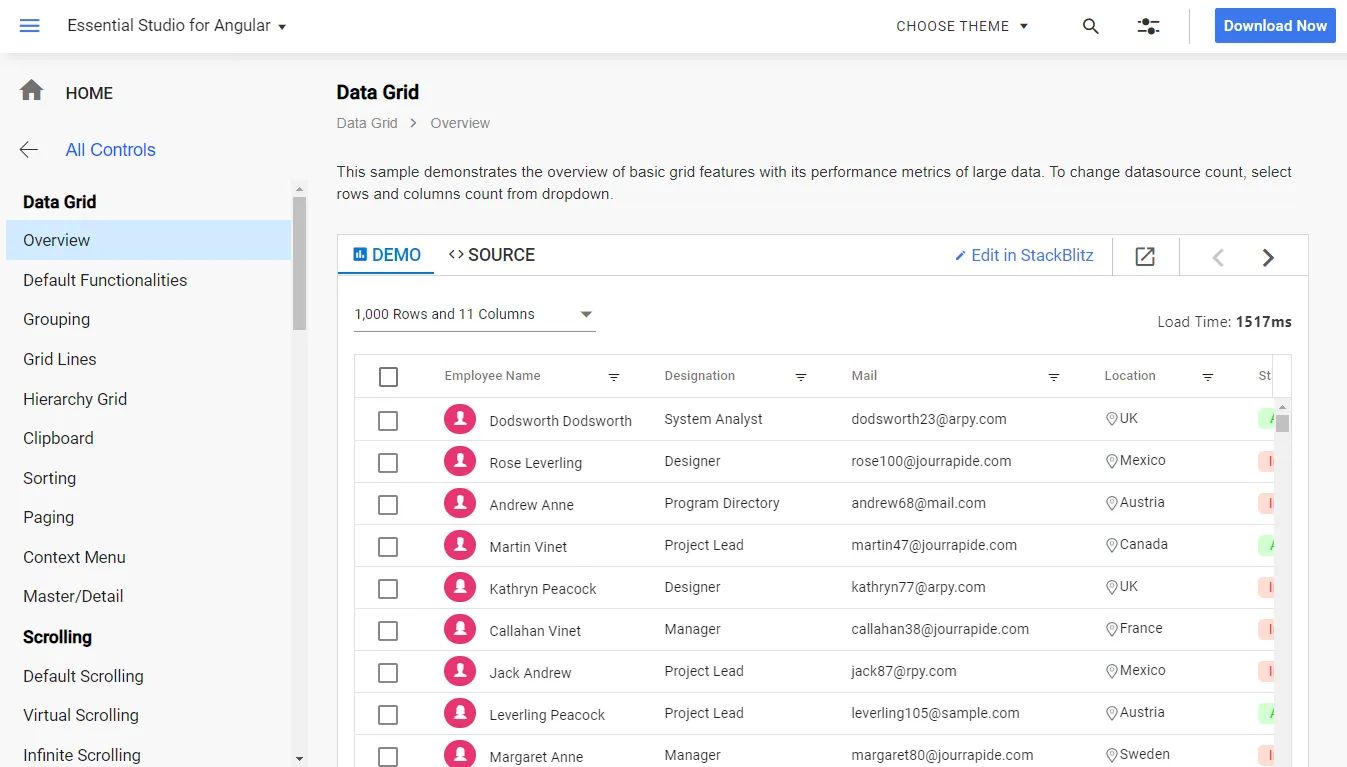
Syncfusion offers a free community license for individuals and small businesses, making Essential JS 2 accessible for a wide range of projects despite being a commercial library.
NGX MATERIALIZE
NGX Materialize is an Angular wrapper for Materialize CSS, a responsive front-end framework based on Google's Material Design. It provides Angular directives and components for Materialize's UI elements, including modals, tooltips, dropdowns, parallax sections, and media components.
It's a viable option for teams familiar with Materialize CSS who want to use it within an Angular project without manually managing DOM interactions.
ANGULAR CHART JS

Angular Chart JS provides Angular bindings for Chart.js, enabling you to add bar charts, line charts, pie charts, and other visualizations to Angular applications. It exposes Chart.js configuration through Angular's component input system, making it easy to bind chart data reactively.
It's a widely used charting solution for Angular projects that need straightforward data visualization without a heavy charting library.
SNOTIFY NOTIFICATION CENTER

Snotify is a notification library for Angular that provides styled toast notifications with a flexible API. It supports multiple notification types, including success, error, warning, info, and confirmation dialogs, all with configurable timers, positions, and animation effects.
Snotify is a polished alternative to simpler toast libraries when you need more control over notification behavior and styling.
{{cta="/service-blocks"}}
Conclusion
The Angular ecosystem provides an impressive array of ready-to-use components that can dramatically accelerate your development process. Whether you need a comprehensive UI library like Angular Material or PrimeNG, specialized components like AG Grid for data tables, or utilities like NGX-Translate for internationalization, there's a component for virtually every use case.
When selecting Angular components for your project, remember to consider factors like maintenance status, community size, accessibility support, and bundle size. The right components can save countless hours of development time and ensure a high-quality, consistent user experience.
At Akveo, we have extensive experience building Angular applications and choosing the right components for each project. Whether you need help selecting the right Angular components for your project, building a custom Angular application, or integrating Angular into your existing systems, our team of Angular experts is here to help. Contact us today to discuss your project requirements, whether it's a dashboard, a data analytics solution, or something else.
If you have questions about web development, Angular functionality, or anything else, feel free to contact the Akveo team. With extensive experience in this field, particularly in building famous open-source products, we'll be glad to help you.